

A horse skull pressed to the face of a bandaged human body should read as pure death-metal provocation, and for years I assumed the front of ‘Serenades’ was exactly that — a doom band reaching for the nearest ossuary prop. Looking at it again, what David Penprase actually made is stranger and quieter than shock.
The figure is not a corpse but a living body caught in the act of hiding, wrapped and masked in the same sepia light, and the photograph’s argument is about concealment rather than gore. That distinction is the whole reason this cover still holds a viewer, and it is what a 1993 debut positioned between tenderness and violence needed at its front.
A Study in Doubled Concealment
The central claim I want to make about this image is simple to state and slow to exhaust: its power comes from concealment staged twice over, not from the skull as an object. A viewer’s eye goes first to the animal skull — long-snouted, equine, its teeth and eye sockets catching the brightest values in the frame — and reads horror. But the skull is doing the work of a mask, held up by human hands to the place where a face should be.
Behind and below it stands a body wound in pale strips of cloth, arms crossed protectively over the chest. Two acts of hiding are stacked on one figure: the wrappings that entomb the body and the skull that erases the face. Neither is violence being done; both are things the figure is doing, or having done to it, to remain unseen.
This matters because concealment is a far better fit for what ‘Serenades’ contains than butchery would be. Contemporary writing on the album has tended to describe the cover as merely bizarre — one long-standing review calls the bandaged form holding a skull-like object simply strange and not obviously connected to the idea of serenades. I think that reading stops one step too early. The image is not illustrating a lyric; it is setting a condition — grief that hides its own face — under which the record’s swing between fragility and aggression makes emotional sense.
The Sepia and the Torn Border
Penprase’s most consequential decision is tonal. The entire photograph is pulled into a narrow band of warm browns, burnt orange, and cream, with no true black anchoring the shadows and no clean white releasing the highlights. The brightest points — the crown of the skull, a raised forearm, the edge of a wrapped shoulder — are rendered in near-white cream that reads as lit from within rather than from any locatable source.
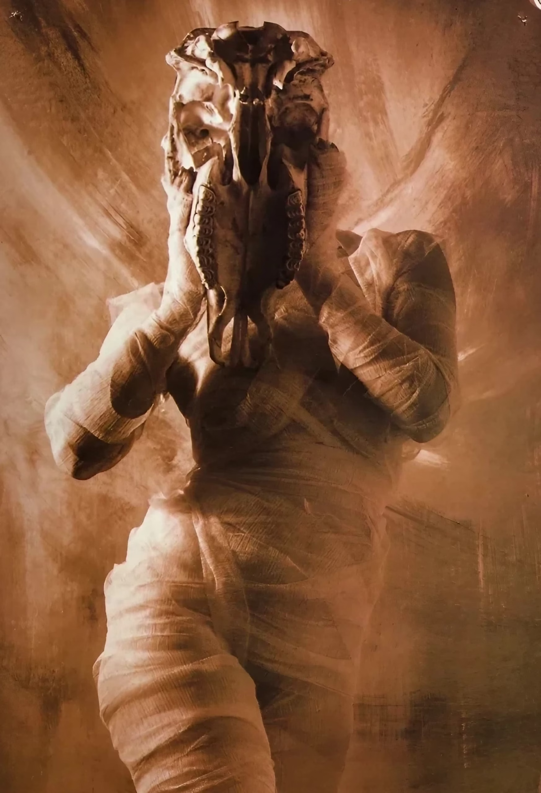
This desaturation is not the reflexively grim palette so much doom art defaults to; it is closer to the chemistry of a damaged nineteenth-century print, and it does something specific: it removes the image from present time. A body this warmly toned cannot be read as a fresh crime. It has already aged into a relic.
The lighting compounds that effect. There is no single hard source and no cast shadow sharp enough to place the figure in a real room; the illumination seems to seep from the pale cloth and the bone itself, so the body glows against a backdrop it never quite touches.
That absence of a grounding shadow is what lifts the figure out of documentary space and into the register of an apparition. The eye cannot locate the light, and so it cannot locate the moment — the picture floats free of any particular time of day, any particular place.
The framing reinforces that displacement. The photograph does not bleed to the edges of the sleeve. It sits inside a torn, deckle-edged black border that behaves like the lip of an old emulsion transfer or a Polaroid lift gone ragged, floating on a plain kraft-paper ground the same warm tone as the image within. That frame-within-the-frame is the compositional key. It tells the viewer, before any figurative content registers, that they are looking at an artifact — a found object, a print recovered from somewhere — rather than a window onto a live scene.
The Anathema wordmark in the upper left and the title set in restrained serif capitals at the lower left leave the photograph almost entirely alone, which is the correct instinct. The image is asked to carry the meaning, and the layout gets out of its way.
Within that border the composition is vertical and centered, the figure rising from the lower edge with the skull-mask at roughly the upper third — near the classical placement for a focal point. Diagonal streaks of light rake across the background from upper right to lower left, giving the flat backdrop motion and preventing the centered pose from turning static.
The crossed arms create a tight knot of overlapping cloth at the body’s core, the busiest passage of texture in the frame, so the eye travels from the skull down into that woven tangle and back up again rather than escaping the figure. Nothing in the picture lets the viewer look away from the act of hiding.
The Name and Its Thin Trail
Every pressing of the album credits the cover photography to David Penprase, consistently and without variation, from the 1993 Peaceville Records original through the 2003 remaster and the 2012 vinyl. On the sleeve his name sits beside Porl Medlock, who shot the black-and-white band images, with design and layout handled by the band and Dave Pybus.
That division of labor tells us the cover was a fine-art photograph set into a designed sleeve, not a painting or an illustration — a distinction that matters for how we credit the image’s effect, since the toning and the torn border are darkroom and design choices as much as anything staged in front of the lens.
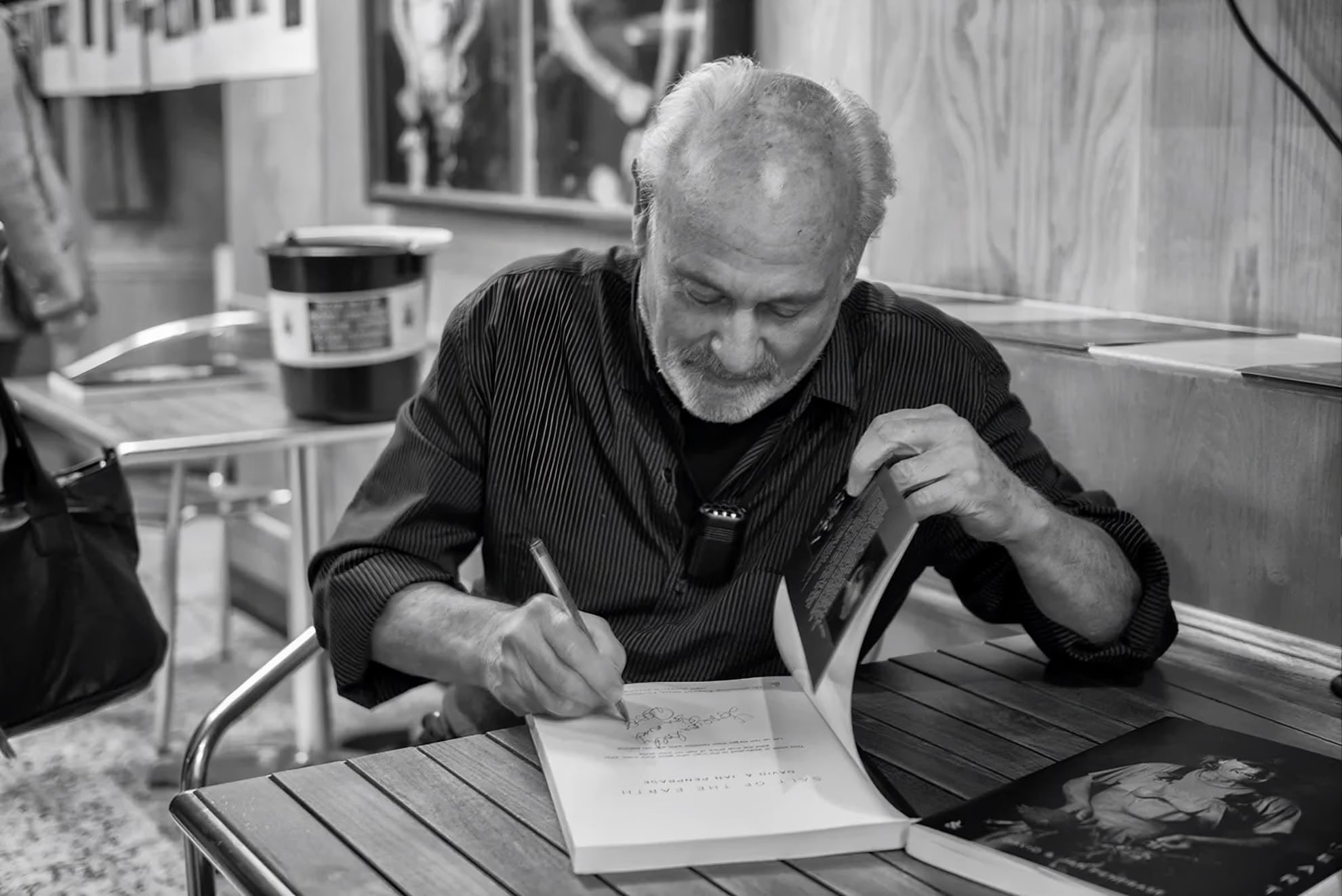
The prompt to place this cover within Penprase’s other work in the field is where the trail turns genuinely thin, and it is worth reporting what a real search does and does not turn up rather than waving the question away. His music-industry footprint is small: the discographical database that tracks such credits lists him under a single profile with only around five credits total, described simply as a photographer.
He was not, on the evidence, Peaceville’s house photographer — the label’s other flagship doom releases of the moment used different hands, with Richard Moran shooting the front of Paradise Lost’s ‘Gothic,’ for instance. And within Anathema’s own run, the ‘Serenades’ commission was a one-off.
The band did not keep him; their next records reached instead for old-master paintings and other photographers entirely — a Joseph Wright of Derby canvas on ‘The Silent Enigma’ with photography by Simon Mooney and Meany, a Frederic Leighton painting on ‘Pentecost III.’ This image, in other words, is not one node in a visible Penprase style spanning the genre; it is a discrete piece of work whose sensibility has to be read from the print itself rather than triangulated across a body of covers.
The credited photographer is a working fine-art artist, which resolves a question earlier drafts left open. David Penprase published a monograph, ‘Untitled: The Photography of David Penprase,’ through the specialist black-and-white imprint Creative Monochrome in 1994, and a second, ‘Beyond the Edge,’ through the same imprint in 1998 — the year after ‘Serenades’ — and works out of Newlyn, Cornwall, exclusively in black-and-white film, exhibiting through the Royal Photographic Society.
That fine-art practice, built on drapes, wraps, and theatrical monochrome portraiture, is plainly the sensibility on this sleeve. This reframes how the image reached the record. The stark separation between a Cornwall fine-art studio and a Liverpool doom band on a West Yorkshire label points away from a standard music commission and toward a licensing arrangement — the band, working with designer Dave Pybus, most likely selecting an existing print from Penprase’s portfolio rather than hiring him for a shoot, which would also explain his near-total absence from music credits elsewhere.
I want to be exact about the evidence: no interview or reissue text I have found documents that transaction, so the licensing account is an inference from the surrounding facts, not a confirmed sale. What the sources do establish plainly is the rest — the cover of ‘Serenades’ is the confirmed work of fine-art photographer David Penprase, whose footprint in music is sparse precisely because music was never his field, his reputation resting on gallery and monograph work — a scarcity that is partly a matter of that gallery career and partly a fact of a 1993 sleeve whose paper trail was never digitized.
That is a thinner music-industry record than a Dan Seagrave or a Zbigniew Bielak would earn, and it should be, because the record is thin — but it is thin after looking, not instead of looking.
Wrapped Grief and the Record
The relationship between this image and the album is not one of direct illustration, and any honest reading has to argue it rather than assert it. ‘Serenades’ is a death doom debut whose documented lyrical concerns run through being lovelorn on the opening ‘Lovelorn Rhapsody,’ and lust on ‘Under a Veil (Of Black Lace),’ its grief turned inward rather than outward.
Those are not subjects that call for a skull as a trophy. They are subjects about interior states that hide — desire, mourning, damage — the emotional territory of a body that wraps itself up and holds something over its own face.
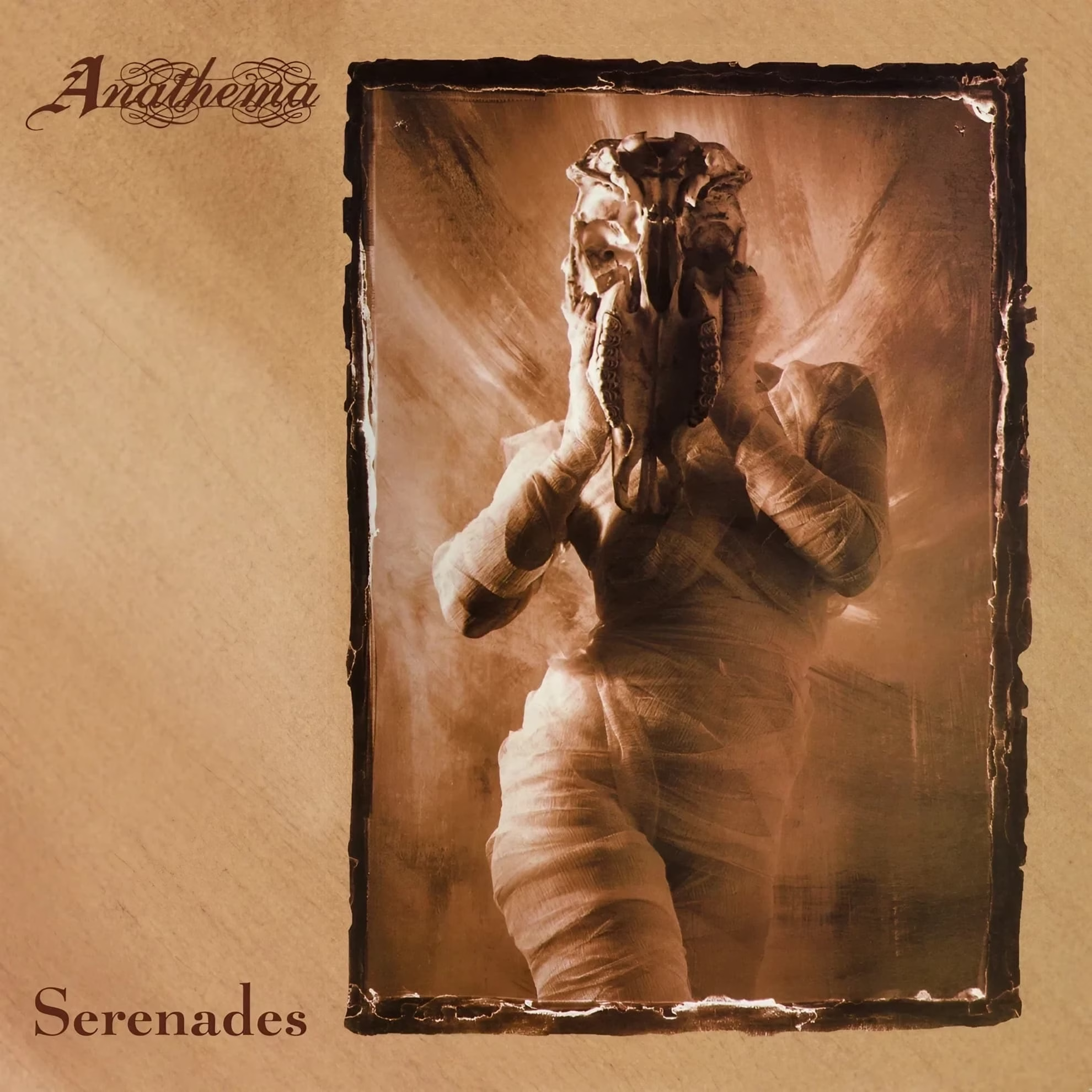
Consider the title of the record’s most explicit gesture toward concealment, ‘Under a Veil (Of Black Lace).’ A veil is precisely what the cover figure has made of the animal skull and the winding cloth: a covering that both conceals and announces that something is being concealed.
The album’s own language reaches for the vocabulary of hiding, and the image answers in kind, in a different medium. The music’s structure makes the same argument. The record was described in its own time as blending fragility with raging aggression, moving between acoustic passages with female vocals and heavy death doom weight — a body that is at once tender and armored. Penprase’s figure is the still-frame of exactly that condition: soft wrapped flesh and a hard bone mask occupying one silhouette, in one unbroken light.
This is why the sepia treatment is load-bearing rather than decorative. A record preoccupied with grief that has already happened — lovelornness, trauma, the aftermath of desire — is better fronted by an image that reads as recovered from the past than by one that reads as a present-tense threat.
The toning places the figure’s suffering in a completed tense. The music, for all its heaviness, is elegiac more than it is aggressive-for-its-own-sake, and an elegy wants a relic on its cover, not a fresh wound.
Against the Grain of Its Scene
It is worth naming what this cover refuses, because the refusal is part of its argument. The early-1990s death and doom scene that Anathema emerged from — the Peaceville roster of Paradise Lost and My Dying Bride chief among its neighbors — had a well-established visual grammar of literal morbidity and high-contrast gloom.
Penprase’s photograph declines almost all of it. There is no black, no green rot, no legible gore, no fantasy landscape. The single most disturbing object in the frame, the animal skull, is lit like a devotional relic and toned like an heirloom. The horror is real but it has been aestheticized into something closer to memento mori than to shock — the long tradition of the death’s-head as a meditation on mortality rather than a threat of it.
That restraint is also why the image survived the album’s own history of reissues and recolorings. The 1994 American edition shifted the front toward a redder orange while keeping the composition intact, and the picture held up under the change precisely because its effect never depended on a specific lurid hue — it depended on tonal compression and the artifact framing, both of which survive a warmer or cooler cast. An image built on shock would have curdled under recoloring. One built on the idea of a recovered relic simply took on a slightly different age.
What the Mask Keeps
What keeps me returning to this cover is that it withholds the thing every death metal sleeve is expected to deliver: a face, a victim, a clear act of violence to recoil from. Penprase gives none of it. He gives a living body that has chosen or been made to disappear behind bone and cloth, lit so warmly that its ordeal reads as already long past.
The skull is not there to frighten; it is there to stand in for the face the figure will not show us. That is a more sophisticated proposition than the genre usually attempts, and it is why ‘Serenades’ fronts its swing between tenderness and force with an image about hiding rather than one about killing. The photograph argues, in a medium the album cannot use, the same thing the record argues in sound: that grief most often shows itself by covering its own face.
When an album cover conceals as deliberately as this one does — refusing the face, the victim, the obvious wound — does that withholding draw you further into the record, or do you find yourself wanting the image to show its hand?
Leave a Reply